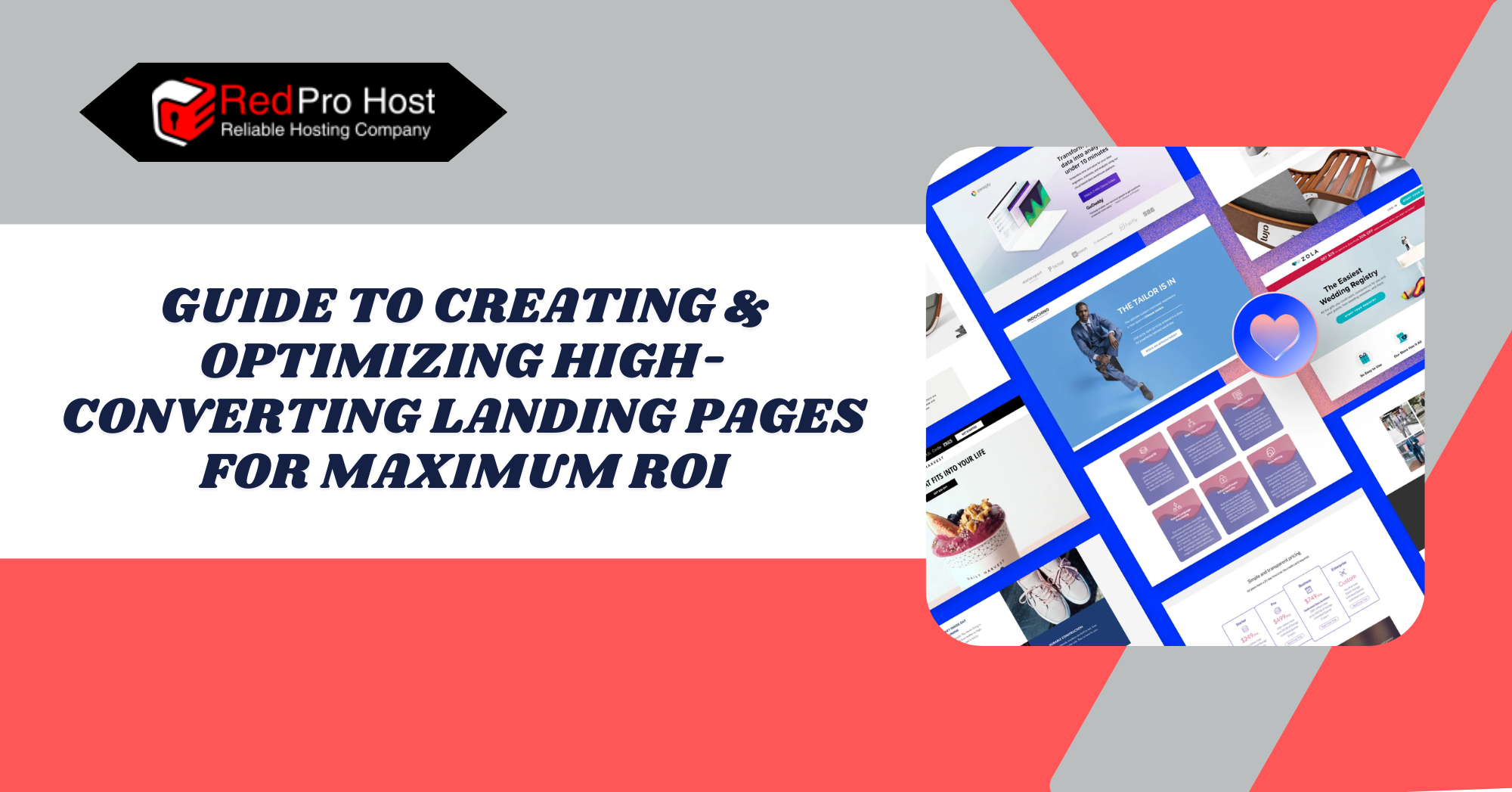
Introduction: The Basics of a Landing Page
Crafting an effective landing page determines whether site visitors become paying customers. The landing page is the initial online introduction. It serves as a virtual greeting and also decides whether someone will keep going or leave the website.
High-converting landing pages are key tools for boosting revenue and growing a business. They impact conversion goals for all organizations.
Many companies invest heavily in getting visitors to their websites, but they often lose interest before they engage. The issue isn’t just the offer itself; it’s also about how it’s presented.
A landing page needs to quickly grab visitors’ attention and clearly state its value. It should also make it easy for them to take action. Success relies on the smooth interaction of psychological elements, design principles, and strategic thinking.
A landing page needs a strong heading and persuasive content. It should also have a clear CTA to start getting results. Combining visual design, social proof, and a user-friendly layout guides visitors to convert. International users on mobile devices now make up a large part of internet traffic. This shift makes it crucial to optimize for all devices.
A business can boost its return on investment (ROI) by turning visitors into loyal customers. To do this, it must understand successful landing page principles. Also, ongoing testing and measurement are key. For more guides like this, Visit our Blog!
What is a Landing Page, and What is Its Purpose
A landing page is a standalone web page designed to convert visitors. It serves a different purpose than regular web pages. Landing pages focus on guiding visitors through a single conversion process.
The desired action on a landing page can vary. It might include subscribing to a newsletter, getting an eBook, registering for a webinar, or completing a purchase.
Companies use landing pages to generate leads with special offers and create sales opportunities. Landing pages focus on what matters, avoiding extra links or information. Removing all distractions helps users focus on the key offer and the next step.
Types of Landing Pages: Exploring Various Formats
Landing pages take different forms depending on the goal users need to achieve. Various landing page formats exist, including the following.
- Lead Generation Landing Pages gather visitor information through form submissions. These pages are often used for email sign-ups, free trials, and gated content like eBooks and whitepapers.
- Click-Through Landing Pages – These act as a bridge between an ad and the final conversion page. Users see all offer details on these pages as they move to checkout or sign up.
- Sales pages: The primary purpose of sales pages is to promote and sell products/services. They are often longer and more detailed. The pages aim to convert visitors into customers. They use persuasive copy and include testimonials. Pricing information is also provided to encourage purchases.
- Webinar/Event Registration Pages: These pages allow users to register for upcoming events and provide crucial information regarding event benefits and expectations.
- Squeeze pages: These are very simple. They aim to collect email addresses. Often, users get something free in return, like a discount code or a helpful resource.
Key Differences Between Landing Pages and Homepages
A landing page and a homepage may look alike, but they have different purposes.
- Focus: A site’s homepage is its starting point. It allows visitors to explore different sections. However, it doesn’t have the clear focus of a landing page. Landing pages have one clear purpose: They eliminate distractions to guide users toward a single choice.
- Navigation: Most home pages have links and different options to explore sections of the website. A landing page keeps it simple. It removes navigation controls so users stay on the page.
- Audience: The homepage targets visitors looking to discover the brand, view products, or learn about the business. Users who reach landing pages often come from targeted ads, including email marketing and campaigns, showing some interest.
- Conversion Intent: A homepage shares information and guides visitors to other sections. In contrast, landing pages aim to convert visitors into leads or customers.
Power Your Success with RedPro Host Dedicated Servers! Join Now!
Unleash the Power of Dedicated Servers! Sign Up with RedPro Host for Ultimate Control!
Key Elements of a High-Converting Landing Page
The landing page needs the correct elements placed well to turn site visitors into customers. Every section on the page should attract users and build trust. It should also make action steps feel like automatic choices.
Compelling Headline & Subheadline
When page visitors arrive, they initially see your headline. The page only has several seconds to catch their interest and make them want to keep reading. A high-quality headline addresses precisely what visitors need, pain points, or desire. Keep the message clear and strong. Avoid adding extra details that could confuse readers.
Address the main priorities that your audience values. Visitors seek tools that reduce the duration of their work. Are they looking to save time, make more money, or solve a frustrating problem? A strong headline answers the question: Why should I care?
For example:
- “Get More Leads in 7 Days—Without Spending a Fortune on Ads”
- “Finally, a Time-Tracking App That Works for Busy Freelancers”
These headlines are specific, solution-oriented, and immediately relevant to the reader.
Writing an Engaging Subheadline That Reinforces the Message: After catching their attention with the headline, the subheadline ensures their continued interest. This extra description adds to the main idea and gives visitors the information they need to stay longer.
A good subheadline should:
- Support and expand on the headline
- Address potential objections or concerns
- Create curiosity or excitement about what’s next
For example, following our previous headlines:
- “Our easy-to-use platform helps you attract high-quality leads—without complicated funnels or tech headaches.”
- “Track every billable hour, get paid faster, and stay organized—all in one simple dashboard.”
The sub-headline and headline clearly tell visitors what they will receive from the offer, and they do it appealingly. They work together to help visitors read the landing page. This makes it clear why they should stay and take action.
Clear & Concise Value Proposition: Every landing page must answer the visitor’s top question: What’s in it for me? A value proposition is key. It explains the benefits to visitors.
Your audience requires both an explanation of the offer and the rationale behind its importance. A strong value proposition shows how your product improves customers’ lives. It focuses on solving their problems and meeting their needs.
Related Article: The Future of Content Marketing: A 2025 Guide to Success
Communicating Benefits Effectively
The purchasing process involves more than just buying products. Consumers want real solutions first and foremost. Focus on the real benefits—what the user will gain. Features describe functionality, and benefits provide the essential reason why users need them.
For example:
- Feature: “AI-powered analytics tool”
- Benefit: “Get real-time insights and make smarter business decisions effortlessly.”
A simple way to craft a strong value proposition is by answering these three questions:
- What do you offer? (The product or service)
- Who is it for? (Your target audience)
- Why should they care? (The most significant benefit)
A weak value proposition is vague and generic, like: “We help businesses grow.”
A strong one is specific and compelling:
- “Turn more website visitors into paying customers with our easy-to-use conversion tools—no coding required.”
Addressing Pain Points and Offering Solutions: Your visitors are on your page because they have a problem they want to solve. Great value propositions directly tackle client issues by showing that your solution is the best fit.
- Pain Point: “Wasting too much time on social media scheduling?”
- Solution: “Automate your posts in minutes and free up hours every week.”
- Pain Point: “Struggling to generate leads?”
- Solution: “Capture high-quality leads effortlessly with our optimized landing page templates.”
The instant bond between customers and businesses forms when customers see you grasp their issues and offer a specific solution. This boosts conversion possibilities. Keep your message clear and straightforward. This helps avoid rejection.
Engaging Visuals & Design
The landing page design shapes visitor reactions. First impressions matter. A clean, easy-to-read landing page helps visitors navigate smoothly. This builds trust and keeps people engaged, encouraging them to take action.
High-Quality Images, Videos, and Branding: Humans are visual beings. Choosing the right pictures can boost landing pages right away. Visitors should connect with images that reflect genuine brand trust, not stock photos or generic graphics.
- Organizations should use clear, high-definition images that connect to their products or services. If you’re selling a physical product, your page should showcase it in action. If it’s a service, show happy customers using it.
- Videos can boost conversions significantly. An informative video helps simplify complex ideas and builds trust faster than text alone. This can happen through demonstrations, testimonials, or explanations.
- Consistent branding matters. Keep your fonts, colors, and images consistent on all pages. This helps create a professional and polished look.
The Role of Color Psychology and Layout in Conversions: A product’s color selection affects both the viewer’s emotions and behavior. Choosing the right colors can encourage visitors to take action.
- Blue builds trust and reliability. So, it’s an excellent choice for financial and tech companies.
- Red sparks a feeling of enthusiasm along with a sense of urgency in limited-time offers.
- Green feels fresh and natural (popular with wellness and eco-friendly brands).
- Yellow and orange colors spark action and good feelings in design. But, they should be used carefully to avoid overwhelming the viewer.
The layout also affects conversions. A well-structured page should have:
- A clear visual hierarchy (most important info at the top)
- Plenty of white space to keep things uncluttered
- A prominent, easy-to-spot call-to-action (CTA) button
- A natural flow that guides the eye from the headline to the CTA
Visual appeal on landing pages helps with accessibility and engagement. It makes it easier for users to interact and take action. Good design choices and clear visuals create a smooth experience, leading to higher conversion rates.
Strong Call-to-Action (CTA)
Landing pages need a firm copy, appealing visuals, and clear value propositions. However, they will see lower conversion rates if they lack a clear call to action (CTA).
A CTA represents the pivotal point at which visitors decide whether to proceed with the intended action. Precise execution at this point produces more leads and, thus, sign-ups and sales.
Placement: Your CTA should be impossible to miss. Here’s how to make sure it stands out:
- Position it above the fold (visible without scrolling), so visitors see it immediately.
- Use it wisely across the page, especially after essential sections where visitors may want to take action.
- Use directional cues (arrows, images, or whitespace) to draw attention to the button.
Wording: A generic “Submit” or “Click Here” will not inspire action. CTAs work best when they show what to do and highlight the user’s benefits. Show the benefits of clicking to encourage action instead of just telling people to click.
Examples:
- “Get My Free Guide” (instead of “Download”)
- “Start Saving Today” (instead of “Sign Up”)
- “Try It Risk-Free” (instead of “Buy Now”)
When creating CTAs, use first-person language. For example, use “Claim My Discount” instead of “Claim Your Discount.” This change makes it feel more personal, which can boost the conversion rate.
Design: Your CTA button should stand out visually:
- Use a bold, contrasting color that pops against the background.
- Make it big enough to grab attention but not so large that it looks out of place.
- Give it some breathing room—don’t clutter it with too much text or design elements around it.
Create Urgency and Encourage Action: People are more likely to act when they feel a sense of urgency or exclusivity. Here’s how to encourage immediate action:
Use time-sensitive language:
- “Limited Spots Available”
- “Offer Ends Soon”
- “Get 50% Off – Today Only”
Highlight scarcity:
- “Only 5 Left in Stock”
- “Join 10,000+ Happy Customers”
Reduce friction:
- “No Credit Card Required”
- “Cancel Anytime”
- “Instant Access – No Waiting”
Trust Signals & Social Proof
People are naturally skeptical online. Shoppers want reassurance before they buy. They need this trust until they share their email or join a program. Trust signals, together with social proof, function as essential factors at this point. People are more likely to make choices after seeing positive testimonials from current users.
Testimonials & Reviews: Real user testimonials about your products and services greatly influence potential customers. Strong testimonials build trust and reassure visitors. They show that others have made the same choices, making decisions easier.
Best practices for testimonials:
- Use real names and photos whenever possible—generic, anonymous reviews can feel fake.
- Keep them specific. Use specifics instead of general praise. For example, say, “I boosted my email sign-ups by 40% in just two weeks with this tool.”
- Feature testimonials near key conversion points, like next to the CTA or pricing section.
Case Studies: Case studies prove effective for selling expensive products or services. Show potential customers a real-life example of how your solution solved a client’s problems and led to great results.
A case study is more effective when it includes extra data points, like numbers and before-and-after comparisons.
Learn more about SEO Mastery in our guide on Mastering Keyword Research for SEO, A Detailed Guide.
Trust Badges & Certifications: Trust badges, like security seals and money-back guarantees, show visitors that a site is legitimate. Media mentions also help build trust. Trust badges show that your website is safe. They also prove your product’s credibility and reflect customer trust in your services. Some standard trust signals include:
- Security badges (e.g., “SSL Secured” or “Verified by Visa”) for payment safety
- Logos of well-known clients or partners
- Mentions in media outlets (“As Featured In: Forbes, TechCrunch, etc.”)
- Industry certifications and awards
Showcasing Authority and Credibility: Beyond reviews and badges, credibility comes from showing expertise and transparency. Here’s how to build trust naturally:
- Display real numbers—how many customers you’ve helped, orders completed, or positive reviews received.
- Highlight team expertise—if you or your team have relevant experience, showcase it with a short bio or credentials.
- Be transparent about pricing and policies—hidden fees or vague terms can scare people away.
Lead Capture Forms & Contact Information
The success of landing pages relies on how well they guide visitors to take action. Users can complete actions through the form. They can sign up for a free trial, download an E-Book, or request a demo.
Leads might leave your website if the registration form is too hard to fill out, takes too long, or is poorly placed. Speeding up the form completion process with fewer requirements will encourage users to finish it.
Optimizing Form Length and Fields for Higher Conversions: A successful form employs minimum requirements. Every extra field you ask a visitor to fill out increases the chances that they’ll abandon it. The golden guideline states that information should be requested solely for essential needs.
Best practices for high-converting forms:
- Keep it short. If an email address is enough, don’t ask for a phone number.
- Use clear labels and placeholders. Avoid vague terms like “Enter your details”—be specific (e.g., “Enter your business email”).
- Reduce friction with autofill. Let users breeze through by enabling autofill for names and emails.
- Break longer forms into steps. If you must ask for multiple details, use a multi-step format to make it less overwhelming.
A shorter, well-designed form removes barriers and makes signing up feel effortless.
The Role of Chatbots and Live Chat: Gathering leads does not need to depend solely on forms. Current business operations use chatbots and live chat to engage visitors immediately and help guide potential customers to successful outcomes.
How chatbots & live chat improve conversions:
- Quick answers for visitors: Users receive instant responses without leaving the page.
- Personalized recommendations: Chatbots can ask simple questions. Then, they suggest the best product, plan, or service.
- 24/7 support: Chatbots are always on. They capture leads any time, day or night, unlike human reps.
Live chat is beneficial for high-ticket products and services. Clients often need reassurance before finalizing their purchase, and chatting with a customer service rep can help visitors complete their purchase.

Optimization Strategies for Maximum ROI
Creating a landing page is just the first step. To truly maximize ROI, ongoing tweaks and improvements are needed. Small changes, such as changing a headline or a button color, can significantly boost conversions. The key is to test, analyze, and refine until every part of the page is working as efficiently as possible.
A/B Testing: Find What Works
No matter how well-designed a landing page is, there’s always room for improvement. A/B testing (also called split testing) is one of the best ways to figure out what resonates most with your audience.
It’s simple. You create two versions of a page, changing one element, like the CTA, headline, or image. Then, you check which version performs better. Minor optimizations add up over time, boosting conversions and improving ROI.
Some elements worth testing:
- Headline wording & length
- CTA text and button color
- Images vs. videos
- Form length (fewer fields vs. more details)
Page Load Speed: Faster = More Conversions
Nobody likes a slow website. If a page takes more than a few seconds to load, visitors will bounce before they even see the offer. Speed matters—a lot.
Ways to improve load time:
- Compress images so they don’t slow down the page
- Use simple, clean code without unnecessary scripts
- Choose a reliable hosting provider that ensures fast performance
A faster page means fewer drop-offs and more conversions.
Mobile Optimization: Meet Users Where They Are
More than half of all web traffic comes from mobile devices. If a landing page isn’t mobile-friendly, it’s losing potential customers—period.
Key things to check:
- Does the page adjust appropriately on different screen sizes?
- Is the CTA button easy to tap?
- Do forms work smoothly on mobile?
A landing page should feel just as smooth on a phone as it does on a desktop.
Retargeting: Bring Visitors Back
Not everyone converts the first time they visit a landing page. Some need a little more convincing. Retargeting ads remind visitors of the offer, helping to bring them back after they leave.
A well-timed ad can re-engage them and push them toward taking action. This strategy works exceptionally well for e-commerce, free trials, and lead-generation campaigns.
Analyzing & Improving
A landing page should never be “set it and forget it.” Checking analytics regularly — like bounce rate, conversion rate, and time on page — helps find areas for improvement.
If people are leaving without converting, it’s a sign that something isn’t clicking. Maybe the CTA isn’t strong enough, the form is too long, or the value prop isn’t clear. The only way to know for sure is to keep testing, tweaking, and improving.
Tracking Performance & Measuring Success
Creating a landing page is just one part of the equation. The real magic happens when you track its performance and tweak it for better results. Without data, you’re just guessing. With the right insights, you can fine-tune your page to convert more visitors and boost ROI.
Key Metrics to Monitor: Important Indicators
Not all numbers matter. Some look impressive but don’t actually tell you if your landing page is working. Focus on the metrics that show how visitors use the page and if they convert.
- Conversion Rate – The percentage of visitors who take the desired action (sign up, buy, request a demo, etc.). This is your #1 indicator of success.
- Bounce Rate – How many people leave the page without taking any action. A high bounce rate means something isn’t clicking.
- Time on Page—If people stay on the page for just a few seconds, they’re probably not engaged. Longer time on the page usually means your content is holding their interest.
- Traffic Sources—Knowing where visitors come from (Google search, social media, paid ads) helps you determine which channels bring the best leads.
- Form Abandonment Rate – If users start filling out your form but don’t finish, it could mean it’s too long or confusing.
Tracking Tools: Effective Solutions For Tracking
You don’t need to guess what’s working. Plenty of tools show exactly how users behave on your page.
- Google Analytics – Tracks traffic, bounce rates, and conversions. Essential for monitoring overall performance.
- Hotjar or Crazy Egg—Heat Maps and session recordings show where visitors click, scroll, and drop off, perfect for spotting friction points.
- Facebook Pixel & Google Ads Tracking—This tool helps track conversions from paid ads so you can see if your ad spend is paying off.
- A/B Testing Tools (Optimizely, Google Optimize) let you compare different page versions to see which performs better.
Adjusting Strategies Based on Data Insights
Once you have the data, the next step is to make changes. But don’t change everything at once—minor tweaks based on clear insights work best.
- If your bounce rate is high, test a new headline or make the CTA more compelling.
- If visitors aren’t scrolling down, move the key information higher up.
- If form abandonment is an issue, remove unnecessary fields or add a progress bar.
- If specific traffic sources convert better than others, focus on what’s working and tweak or eliminate what isn’t.
Common Landing Page Mistakes & How to Avoid Them
Even the best-designed landing pages can fail if they have critical mistakes. The frustrating part? Many of these mistakes are easy to fix. But if you don’t know what to look for, you could be losing leads without even realizing it. Here are some of the most common landing page mistakes—and how to avoid them.
1. Too Many Distractions: Your landing page should have one clear goal. Too many links, buttons, or extra text can overwhelm visitors, and they might leave without taking action.
How to fix it:
- Keep the design simple and focused.
- Remove the navigation menu so users don’t click away.
- Make sure the call-to-action (CTA) stands out and is easy to find.
2. Weak or Confusing Headline: Your headline is the first thing visitors see. If it’s vague, dull, or doesn’t explain the value of your offer, people won’t stick around to learn more.
How to fix it:
- Make the headline clear and benefit-driven.
- Avoid generic phrases like “Welcome to Our Website.” Instead, go for something direct: “Boost Your Sales by 50% with This Simple Strategy.”
- Use a subheadline to reinforce your message and keep users engaged.
3. Asking for Too Much Information: People don’t want to spend time filling out a long form. The more fields you ask for, the less likely they are to complete it.
How to fix it:
- Only ask for what’s necessary (name and email are usually enough).
- If you need more details, use a multi-step form to make it feel less overwhelming.
- Offer something valuable in exchange, like a free resource or discount.
4. Slow Page Load Time: If your page takes more than a few seconds to load, visitors will leave before they even see your offer.
How to fix it:
- Optimize images and compress large files.
- Avoid unnecessary animations or heavy scripts.
- Use a reliable hosting provider to ensure fast performance.
5. Weak Call-to-Action (CTA): A generic or unclear CTA like “Submit” or “Click Here” doesn’t create urgency or excitement. Visitors should immediately know what they’re getting when they click the button.
How to fix it:
- Use action-driven and benefit-focused wording like “Get My Free Guide” or “Start Saving Today.”
- Make the button bold and use a color that stands out.
- Place the CTA in multiple spots on the page so users don’t have to scroll too much to find it.
6. Lack of Social Proof: People trust other people. If your landing page doesn’t show testimonials, reviews, or case studies, visitors may hesitate to take action.
How to fix it:
- Add real testimonials with names and (if possible) photos.
- Display trust badges, like security certifications or media mentions.
- Highlight how many people have already signed up, purchased, or benefited from your offer.
7. Not Optimizing for Mobile: If your landing page isn’t mobile-friendly, you’re losing a massive chunk of potential leads. A clunky, hard-to-navigate page on the phone will send visitors straight to the “back” button.
How to fix it:
- Test your page on different devices to ensure it looks good and functions properly.
- Make buttons and forms easy to tap on a small screen.
- Keep text short and scannable for easy reading.
8. Ignoring A/B Testing: What works for one audience might not work for another. If you’re not testing different elements of your page, you could be wasting conversions.
How to fix it:
- Run A/B tests on headlines, CTAs, images, and layouts to see what performs best.
- Track your results and make data-driven changes.
- Keep experimenting—optimization is an ongoing process.
Experience the Best in WordPress Hosting! Sign Up Today!
Simplify Your WordPress Hosting! Join RedPro Host for Optimized Performance!
Conclusion
Organizations should not rush to create landing pages. Building trust and optimizing for conversions takes careful planning. It takes a mix of psychology, strategy, and constant tweaking to get people to take action.
People need to feel secure before committing to anything, like buying or signing up for services. People trust social proof, trust badges, and clear messaging. These elements help reduce their anxiety. It only takes a slight hint of unease for them to exit the site instantly.
The conversion process dies due to friction, which causes users to leave. Long, complicated forms? Gone. Unclear CTAs? Make them evident and compelling. Small changes in page elements can make a big difference in conversions. Successful pages often make these tweaks, while unsuccessful ones do not.
The work doesn’t stop once the page is live. Testing, analyzing, and making small changes over time can turn a good page into a high-converting one. Sometimes, what you think will work doesn’t. That’s why tracking the correct data and being willing to experiment are key.
It’s all about making it easy for people to say yes. Remove confusion, remove unnecessary roadblocks, and show them why they can trust you. Do that, and conversions will follow.
RedPro Host offers scalability, strong support, and top performance. It empowers businesses to grow and innovate while experts manage their servers. Red Pro Host lets businesses scale and thrive in the digital world, enabling them to achieve long-term success.
FAQs (Frequently Asked Questions)
What makes a landing page actually convert?
It’s a mix of clarity, trust, and ease. People need to know what they’re getting. They should feel safe to act and not be overwhelmed by distractions. A strong headline grabs attention. A clear call-to-action guides users. Social proof, like testimonials, boosts conversions.
How many fields should a lead capture form have?
The fewer, the better. If an email is all you need, don’t ask for a phone number. Every extra step makes people more likely to leave, so keep it as simple as possible. If you need more info, breaking it up into steps can make it feel less like a chore.
Do testimonials really make a difference?
Big time. People trust other people way more than they trust brands. Honest reviews, especially with names and photos, make a huge impact. A generic “This product is great!” won’t do much, but a detailed one with numbers or specifics? That’s gold.
How important is page speed?
This is super important. If a page takes more than a few seconds to load, people will leave before even seeing what you offer. Compress images, clean up unnecessary code, and make sure your hosting isn’t slowing you down. Speed directly affects conversions.
Should I remove navigation links from a landing page?
In most cases, yes. A landing page should have one goal—if there are too many links, people get distracted and wander off. Stay focused. Make the CTA clear. Remove distractions that distract from the main action you want them to take.
What’s the biggest mistake people make with CTAs?
Being too vague or boring. A button that says “Submit” or “Click Here” doesn’t tell people what they’re getting. A better CTA makes the benefit clear, like “Get My Free Guide” or “Start Saving Today.” Also, make sure it stands out—don’t let it blend into the background.
How often should I update or test my landing page?
All the time. Even a well-performing page can always do better. Running A/B tests on headlines, CTA buttons, or images helps discover small changes that create a significant impact. The best landing pages aren’t just set and forgotten—they’re constantly improved.
Latest Posts: